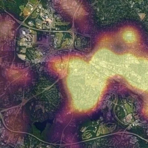
Mapping Exercise: Travel Time Efficiency
Whether buying or building, evaluating the best locations in each market is the most important piece of the puzzle. Not all distances are created equal. Many third party services provide only straight-line distances or route mileage between locations in each market. This data does not include any timing metrics and therefore gives very little insight into real-world travel efficiency.
The following mapping exercise provides a methodical approach to measure travel efficiency from each property within a market to a set of nearby relevant locations. The total dataset (not included here) includes travel times within more than 100 markets, visualizing the number of travel-minutes from each multifamily property to common destinations when walking, biking, driving, using public transit, or driving in morning traffic.
Property data comes from a variety of sources (including the aggregation tool showcased in the "Data” section of this site), timing data was gathered through API/VBA function integration, and the visualizations were subsequently built using HTML/JS. Heat maps may be overlaid, and additional map formats showing real-time traffic, bike routes, and public transit are also toggleable. Several other familiar Google mapping functions are also available for each map.
A sample set of maps is provided below, visualizing travel efficiency from 212 local properties to various destinations (listed below) commonly visited by the NCSU student population in Raleigh.
Maps Listed by Destination
(Combined map averages timing data for each location to provide a general representation of location appeal.)
(Refresh if map does not populate initially)
